
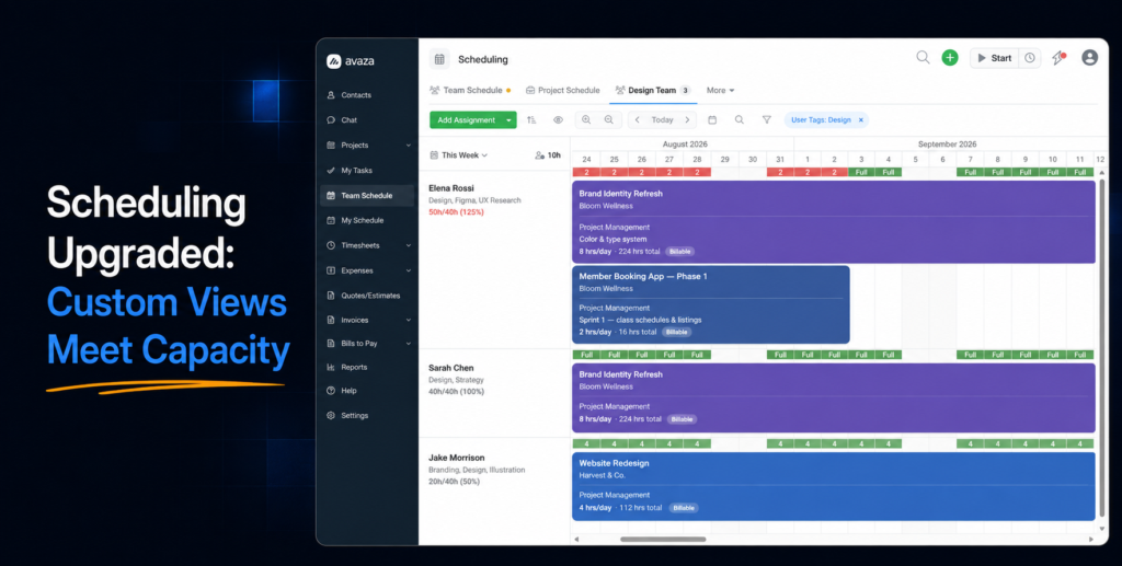
Resource scheduling is where your team’s time gets planned — so it deserves the same flexibility we’ve been rolling out across the rest of Avaza. Today, the Team Schedule page joins Tasks and Projects in getting the full custom views treatment, along with a set of long-requested improvements to sorting, availability visibility, and filtering.
Everything you use today is still here. Your bookings, your Team and Project schedules, your roles and permissions — all unchanged. What’s new is how much more the page can do around them. Here’s the tour.
Your schedule, your views
The biggest change you’ll notice: Team Schedule and Project Schedule are now tabs on a single Scheduling page — and they work exactly like the custom views you may already be using on your task and project pages.

That means you’re no longer limited to the two built-in views. You can now:
- Create your own views — for example, a Team view filtered to your design team, sorted by availability, zoomed out for the month ahead. Set it up once, name it, and it’s one click away forever.
- Save every setting with the view — sort order, date range, bar size, zoom level, and filters are all remembered per view. No more re-applying the same filters every morning.
- Share views with your team — or keep them personal. A shared view looks the same for everyone who opens it, which makes “look at the Q4 crunch view” a much shorter conversation.
- Copy, rename, and reorder views to fit how your team works.
Your settings now live with each view in your account — not in your browser — so they follow you across devices, and shared views keep everyone on the same page.
Availability you can actually plan with
Capacity questions used to require squinting at the grid. Now the answers are right on the page:
- A date range selector (This Week, Next Week, This Month, and more, plus custom ranges) sets the period you’re planning for.
- Every team member’s row shows their numbers for that period — scheduled hours, standard hours, and utilisation, like “31h/40h (78%)”. Overbooked? The percentage turns red. Hover for the full breakdown, including remaining available hours.
- A team-wide Total Available figure sits at the top, telling you at a glance how much unallocated capacity you have across everyone visible.
- Sort by availability to bring your most available people to the top when new work lands — or sort by name when you’re scanning for someone specific.

One design decision worth calling out: these numbers always reflect a person’s complete schedule. Even when you filter the page (more on that below), utilisation and availability keep telling you the truth about how loaded someone actually is. We think a capacity number you can always trust beats one that changes depending on what you happen to be looking at.
Filters that work the way you’d expect
This is the change we most want to explain, because it’s a genuine improvement in behaviour — not just a new look.
Previously, every filter on the Team Schedule worked the same way: it decided which rows appeared. Filtering by a customer, for instance, showed you every person who was a member of that customer’s projects — but their bars still showed all their bookings, for every customer. Many of you told us (and we agreed) that this wasn’t what you expected. When you filter by a customer, you want to see the work for that customer.
So filters now come in two kinds, clearly grouped when you add them:
- Row visibility filters control who (or which projects) appear. On the Team view, that’s Schedule Users and User Tags — people-shaped filters for a people-shaped list.
- Booking visibility filters control which bookings appear. On the Team view, that’s Customers, Projects, Project Categories, and Project Tags. Filter by a customer and you’ll now see exactly the bars that belong to that customer’s projects — with everyone still visible, so you can see who has room to take on more of that work.
On the Project view, the same logic applies in mirror image: project-shaped filters (Customers, Projects, Categories, Tags, Status) control which project rows appear, while people-shaped filters (Schedule Users, User Tags) narrow the bookings to the people you care about — perfect for answering “what is Alice booked on across all our projects?”

Two things to know so nothing surprises you:
- Booking filters never hide people. If someone has no bookings matching your filter, their row stays — empty. That’s useful information: it means they have zero commitments on that work and might be exactly who you’re looking for.
- Applied filters show as chips in the toolbar, so it’s always visible what’s shaping your view, and any filter is one click to remove.
Quality-of-life, everywhere you look
A collection of smaller improvements that add up:

- Compact bars. A new bar size option strips bars down to the essentials, so you can fit far more of your team on screen at once. Switch back to Regular any time — it’s saved per view.
- Zoom that keeps your place. Zooming in or out now keeps the same first date anchored on screen. If you’re looking at October, you stay in October — no more being teleported to a different month mid-thought.
- Dates at every zoom level. Fully zoomed out, each day column now shows its date number, so you always know exactly where you are.
- Jump to any date. A new calendar picker in the toolbar takes you straight to any date — no more holding down the scroll arrow to reach next quarter.
What you don’t have to worry about
We know schedule pages are daily-driver tools, so here’s the change-management summary:
- Nothing is gone. Both classic views are still there, as the default tabs, with your bookings exactly as they were. Creating, dragging, resizing, and editing bookings all work as before.
- Permissions are unchanged. Schedule Managers, Viewers, and Users see and do exactly what their roles allow today.
- No setup required. The page works out of the box just as it always has. The new capabilities — custom views, availability numbers, the new filters — are there when you want them, invisible when you don’t.
- The one behaviour change is the filters described above. If your team has saved habits built around the old row-only filtering, the filter chips and the grouped filter menu make the new behaviour easy to see and easy to learn — and we think you’ll find it does what you always expected it to do.

The upgraded Scheduling page is rolling out to all accounts now. Open your Team Schedule, try saving your first custom view, and let us know what you think — our support team would love to hear how you’re using it.
Happy scheduling!
1 Comment
Okay team! Love the custom view! Very helpful so I can filter different roles and the resources. Love it! Thank you.